Vision Pro (Demo) Impressions

Decided to do an impromptu trip to the closest Apple Store and demo the Apple Vision Pro. The following are my impressions before, during, and after completing the demo - not edited except to add links from the written/scribbles.
Before the Demo
Took some time to collect my thoughts around whether the Vision Pro is a “new“ thing or evolution of the Mac. Compared initial, extended view/feel of the Vision Pro to the Studio Display and iMac. Interestingly, they are not organized in the exact same area. But that might have to do more with space than anything else. Still, definitely felt that (at least in this space) then Apple is positioning spatial computing as a “space” and not just a “space you go to interact.”
During my time, waiting for the demo, they were four (later five people, a woman who is doing a set up) who at least did a demo. Not too many minutes after I got in saw a person walk out with one.
When looking at the Apple studio display and the Mac Mini Studio, or a Mac Mini, there’s much of a sense of “oh, this is mature and the old way.“ It feels as analog as TV did without a remote in the mid 1980s as remotes became more normative, if that makes sense. The Apple Studio Display is great; but it’s constrained by the physics of putting you into a porthole. Not using your World around you as a canvas. iPad is similar, but not; writing or touching it, you are immediately more connected to the “substance on the canvas.“
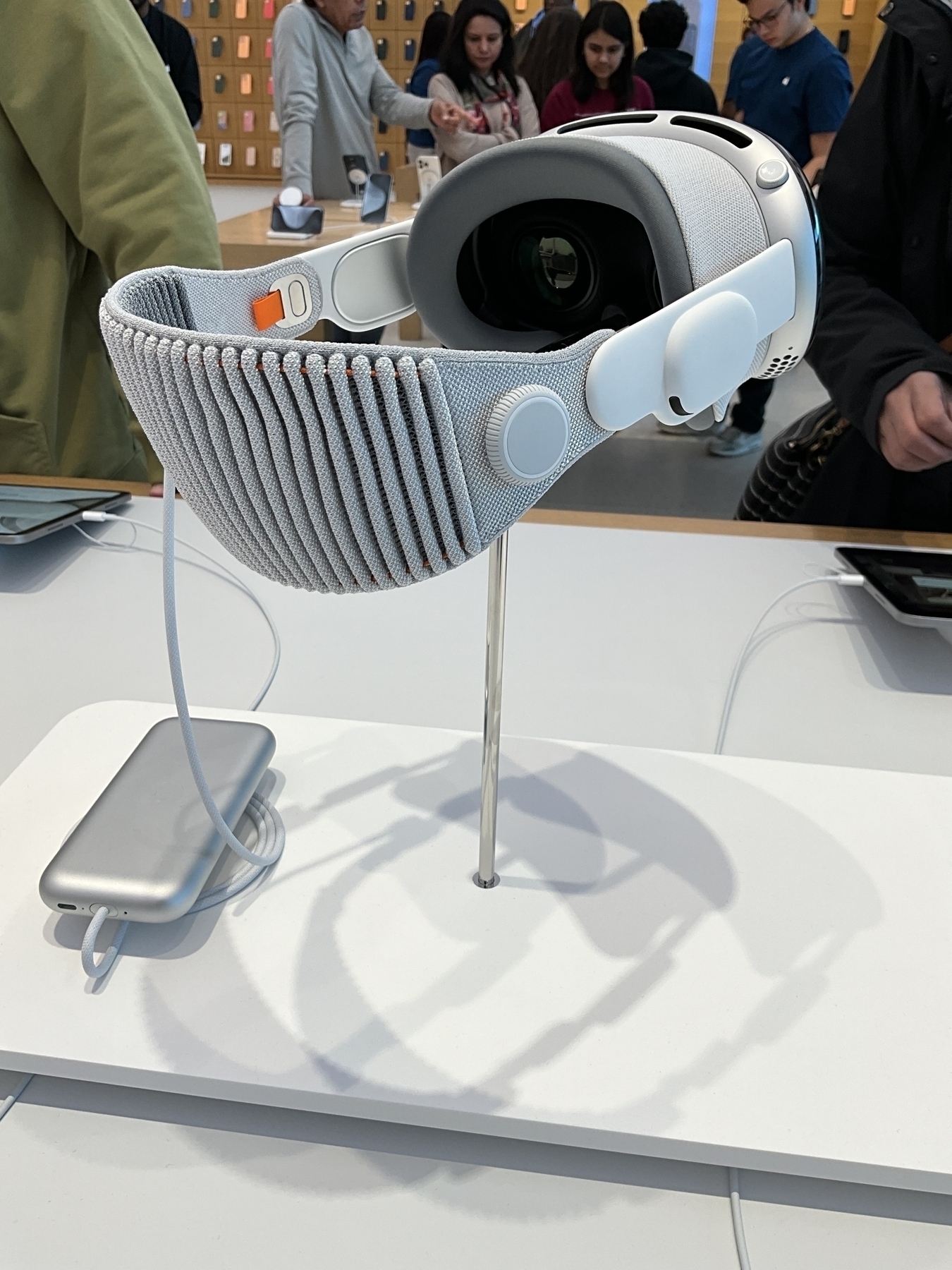
During the Demo (Written Afterwards)
It’s a very well orchestrated demo. Every step of it. Can totally see what is being measured – from the retail connections all the way to the ending experience of sending me a video. (actually recap) of it.
Being able to scan my glasses, and have the device ready in less than 10 minutes for a demo is sick/impressive. The shape of how Apple wants it to be like the better parts of a waiting room experience or a car salesman experience isn’t lost on me at all.
Took me all of no time to know how to move windows. Took longer to figure out how my eyes work versus how “focus“ with the eyes is so necessary. Once you know where to find the controls, it’s just a matter of slowing down to get them from “wanting” to get to them.
Panoramic images are great. Spatial images/videos are amazing. The Alicia Keys bit messed with me a bit too many ways. Lighting, sound, etc. That was a very “ooh “moment. Definitely can see how Apple or others could do a heckuva job with tracking, somatic and emotive reactions.
Needs more than media at the demo. Local fare apps that show the best of spatial computing.
Field of view issues until I really tightened it. It only got to be an issue if your eyes move wider than your head – which is natural and unnatural at the same time.
Would love to have played or extended Muse to this during the demo. But… That’s an exploration for another time.
Didn’t convince me to purchase, but does convince me to pay more attention than I was to AR/VR. My existing play might be informing right – just not from the same frame as others… yet.
15 Minutes After the Demo
It’s an impressive and very curated demo. The ease at which I was able to get into understanding how to navigate was not surprising to me, but was to “Langston), the person leading/facilitating. Was so easy and natural to be ambidextrous. Your eyes really are the key here and you instantly feel the lessons from Face ID – from set up all the way to normative use.
Was it heavy on the face? Yes. Almost uncomfortable until you started to move naturally. There wasn’t this same stuttering on the screen that I get when wearing the XREAL Air.
“Compatible“ apps and multimedia are the worst for this. Making 3-D and spatial content should be table stakes for the vision, pro. In fact, if iPadOS doesn’t push more into a more “mini spatial window“ affair, I’d be disappointed. Immersion is a thing, but this will fit more instances where consumption or focus is more needed.
I get it but it’s a shame so much is in a window/frame. Breaking the glasses, where Vision Pro gains the “aha“ moments
Reading in Safari is good but reader mode needs to do immersion. The frame of the web/world around actually breaks the focus to read. Wonder if content-heavy sites or content management systems (or web developers) will pick up on this?
Keyboard and mice – macOS – as assumed defeats by those doing the demo. Which is fine. I am (Moore) iPad, OS native, and the curve and lessons are different yet similar. The home screen interaction was more compelling than much of the rest. Moving/zooming was more compelling than consuming.